Studio Updates
GRASS! BRAND EVOLUTION
By
Grass! Design
12.07.24
/
5 min read.
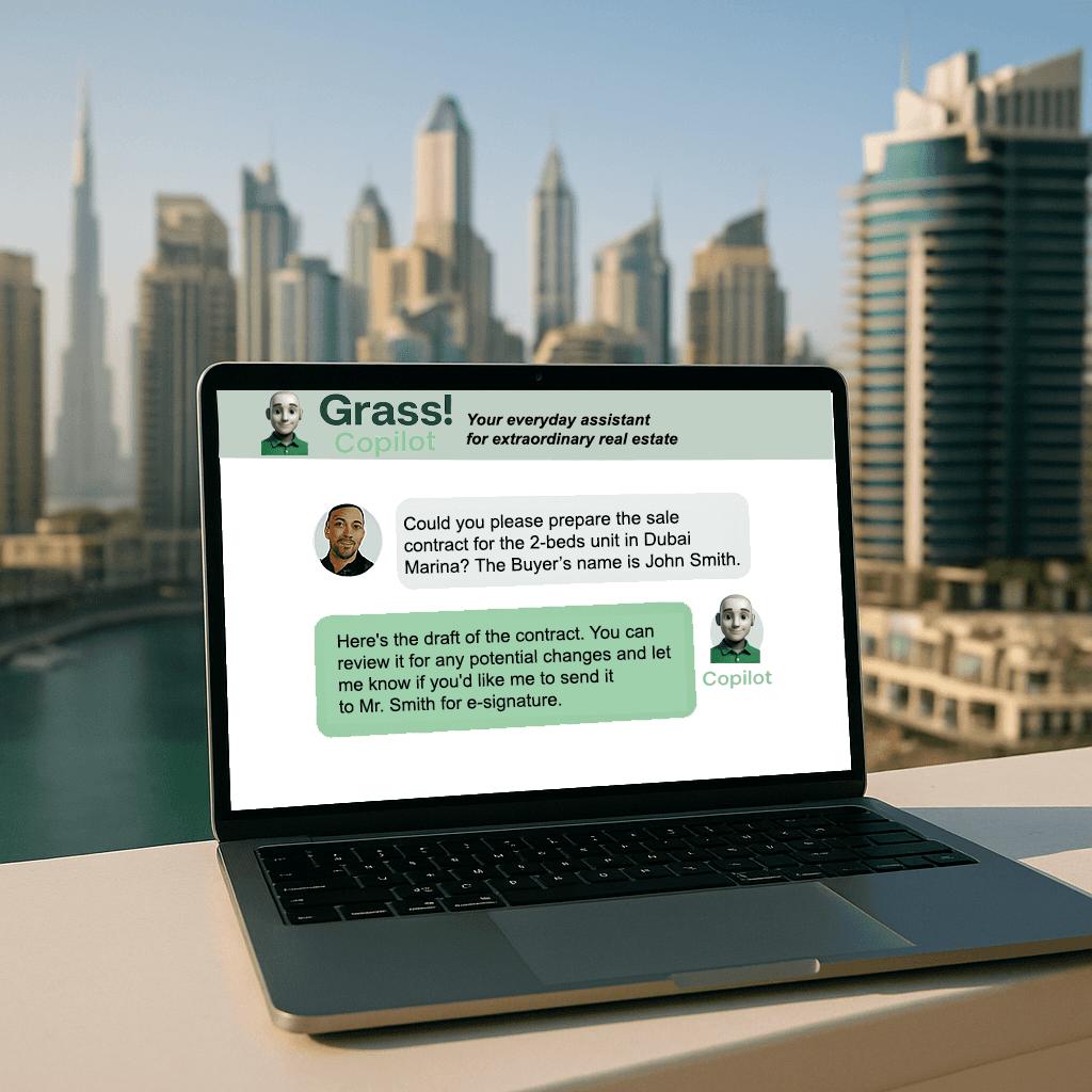
Our Approach: From Open House to Grass!
Before Grass! had a product, it had a purpose: to simplify real estate workflows and give power back to agents. But that purpose needed a voice, a tone, a look, and most importantly, a name.
“We didn’t want to sound like a portal. We wanted to feel like a partner.”
This is the story of how we evolved from Open House to Grass!, a brand that grows with its users, grounded in clarity, trust, and warmth.
Our Process: Designing Identity from the Ground Up
🌱 1. A Name That Grows
Grass! is a metaphor. It’s about organic growth, strong roots, and everyday resilience.
We wanted something fresh but not gimmicky, something grounded in the agent’s real-world hustle.
No jargon. No vanity. Just movement and meaning.
🖋️ 2. A Voice That Speaks Agent
Our brand tone is confident but never cold. Professional, but human.
We write how agents talk. Whether it’s a tooltip in the dashboard or a line on our homepage, the tone says:
“We see you. We’ve got you.”
🎨 3. A Visual Language That Breathes
Color: We chose a fresh green (#21A676) for growth, paired with deep charcoal and white for contrast and elegance.
Typography: Clean sans-serifs that feel modern, but not sterile.
Layouts: Spacious, mobile-first, readable in motion.
The result? A system that scales across dashboards, PDFs, social, and signage, without losing character.
💡 4. Brand Is More Than Design
A brand is also a behavior. For us, that means:
Always replying with clarity
Always shipping with care
Always showing up with empathy
That’s what Grass! means to us, and hopefully, to you.
In Conclusion: From Identity to Integrity
The exclamation point in Grass! isn’t about shouting. It’s about energy.
We believe the agents shaping tomorrow’s real estate deserve tools, and a brand, that meet them with clarity and respect.
We’re not just here to help you close deals.
We’re here to help you grow.